Bringing In-Store Confidence to Online Grocery Shopping
Built and tested 4 new features that recreate the in-person shopping experience, online
Role
UX Research Lead
Goal
Make online grocery as trustworthy and flexible as in-store.
Method
-
15 interviews
-
Competitive analysis
-
Wireframes
-
Usability testing
Outcome
-
4 new features built
-
100% task success
-
Users said it “felt like in-store shopping”
Turning User Hesitation into Product Growth
Users loved the speed of grocery delivery but didn’t trust it for fresh produce or substitutions. Through research, testing, and iteration, I designed and validated 3 features: freshness selector, smarter substitutions, and shopper chat — that turned a frustrating process into one users found as reliable as in-store shopping.
01. The Challenge

Context
Users increasingly rely on online grocery apps for the convenience of packaged goods and household essentials. But when it comes to fresh produce, they still prefer in-store shopping.

User Experience Challenge
How might we bring the confidence and flexibility of in-store grocery shopping into the online experience?
To answer this, we conducted foundational research, combining user interviews and a competitive analysis, to uncover pain points and opportunities.
02. Research Strategy
To uncover what drives trust in telemedicine and how to design for user confidence, I structured the study into two phases. This ensured we moved from understanding user attitudes to co-creating design solutions grounded in real user needs.
Step 1
Foundational & Discovery Research
Goal: Why do users avoid ordering fresh produce online?
Methods: Competitive Analysis, User Interviews (n=5)
Output: User Journey-Pain Point Overlay, Insight–Opportunity Matrix
Step 2
Evaluative and Iterative Research
Goal: Do our new features improve confidence in online grocery shopping?
Methods: Wireframes, Usability Testing (n=5)
Output: User Feedback, and Refined IA and Wireframes
With this strategy, we moved from understanding user behaviors to testing solutions in context, uncovering the key pain points that shaped our design decisions.
03. From Insights to Feature Ideas
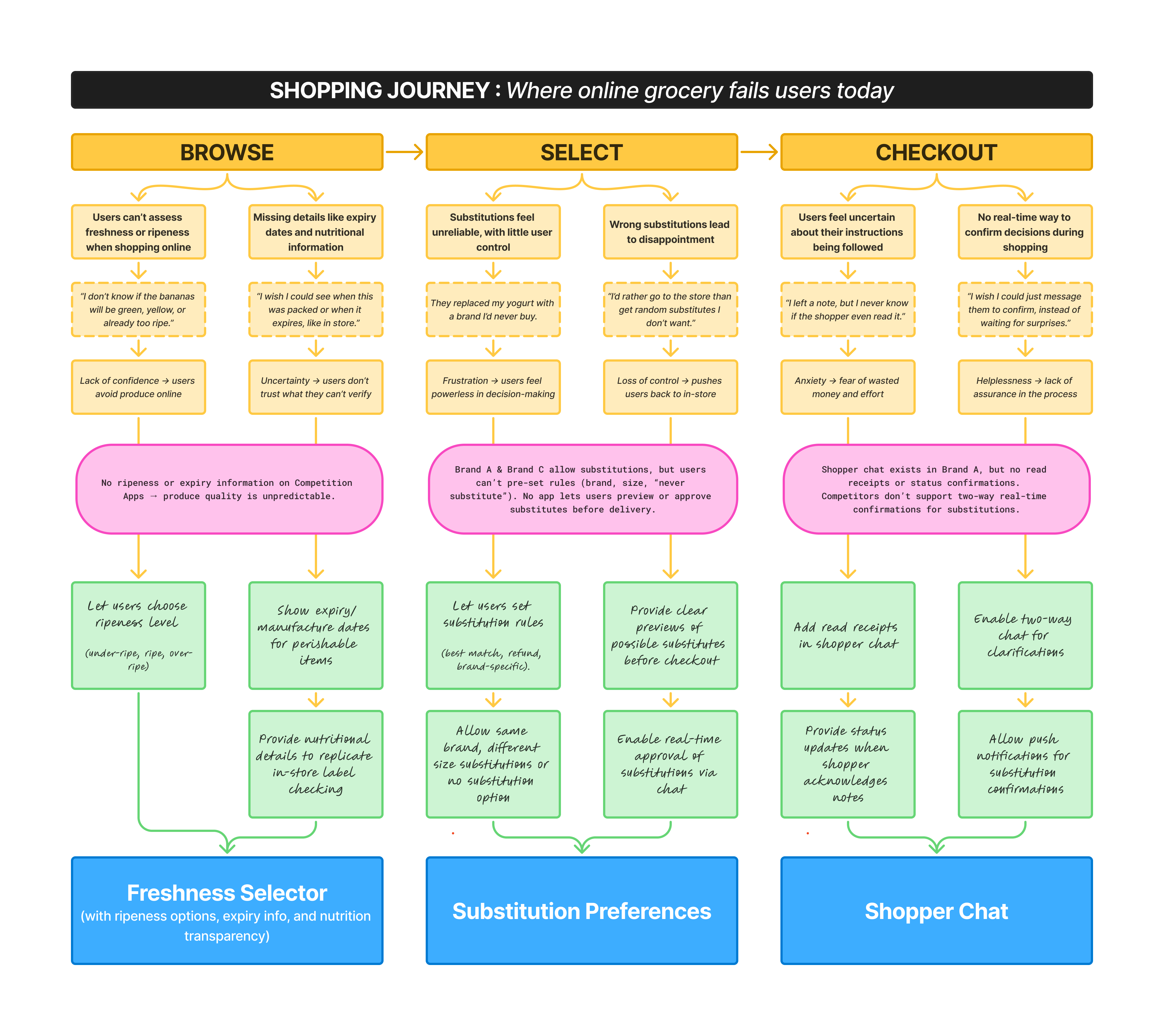
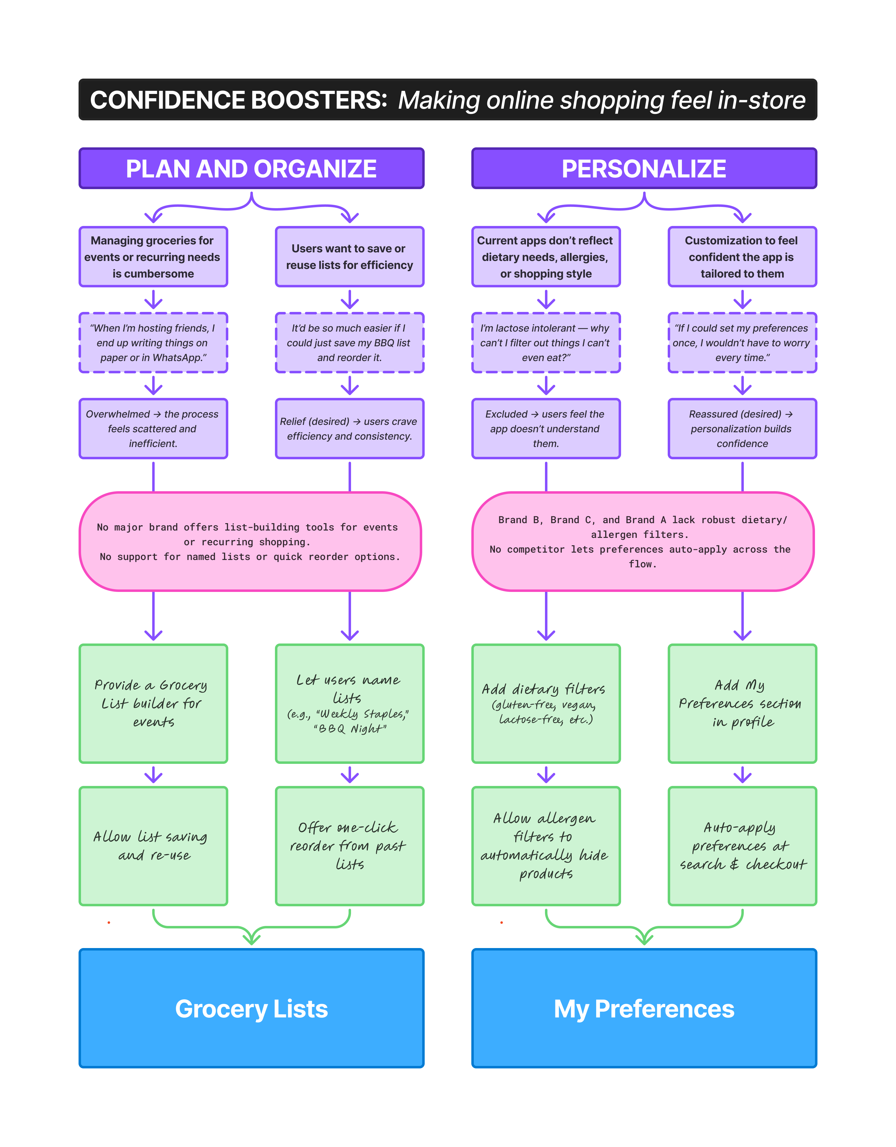
My research revealed that while users appreciated the convenience of online grocery apps, they lacked confidence in buying fresh produce. Pain points spanned the shopping journey, from assessing freshness to handling substitutions and ensuring instructions were followed. I also uncovered supporting needs around planning and personalization that existing platforms failed to address.
To synthesize these findings, I created a User Journey & Pain Point Overlay. This visual connects:
-
User insights (pain points, quotes, emotions)
-
Market gaps (where competitors fell short)
-
Design opportunities
-
Feature ideas that shaped our prototype
Where the Journey Breaks (and How We Fixed It)
A research-to-design map of the grocery experience
With opportunities mapped, we moved into prototyping and testing to see how these solutions performed in real user hands.
04. Designing Solutions and Iterations
With opportunities mapped, I moved into prototyping and testing to see how these solutions performed in real user hands.
01
Structuring Confidence into the Flow
Information Architecture
I worked with designers to translate research insights into a High-Level Information Architecture — a streamlined version of the full IA that captured how the app was envisioned to work. It mapped the core grocery journey (Browse → Select → Checkout), while layering in confidence-boosting features such as Freshness Selector, Substitution Preferences, and Shopper Chat, along with supporting tools like Grocery Lists and My Preferences.
This high-level IA acted as a blueprint for prototyping, aligning the team on priorities and ensuring new solutions integrated seamlessly into familiar shopping behaviors.
Click to Expand
02
Refining Features Through User Feedback
Usability Testing and Iterations
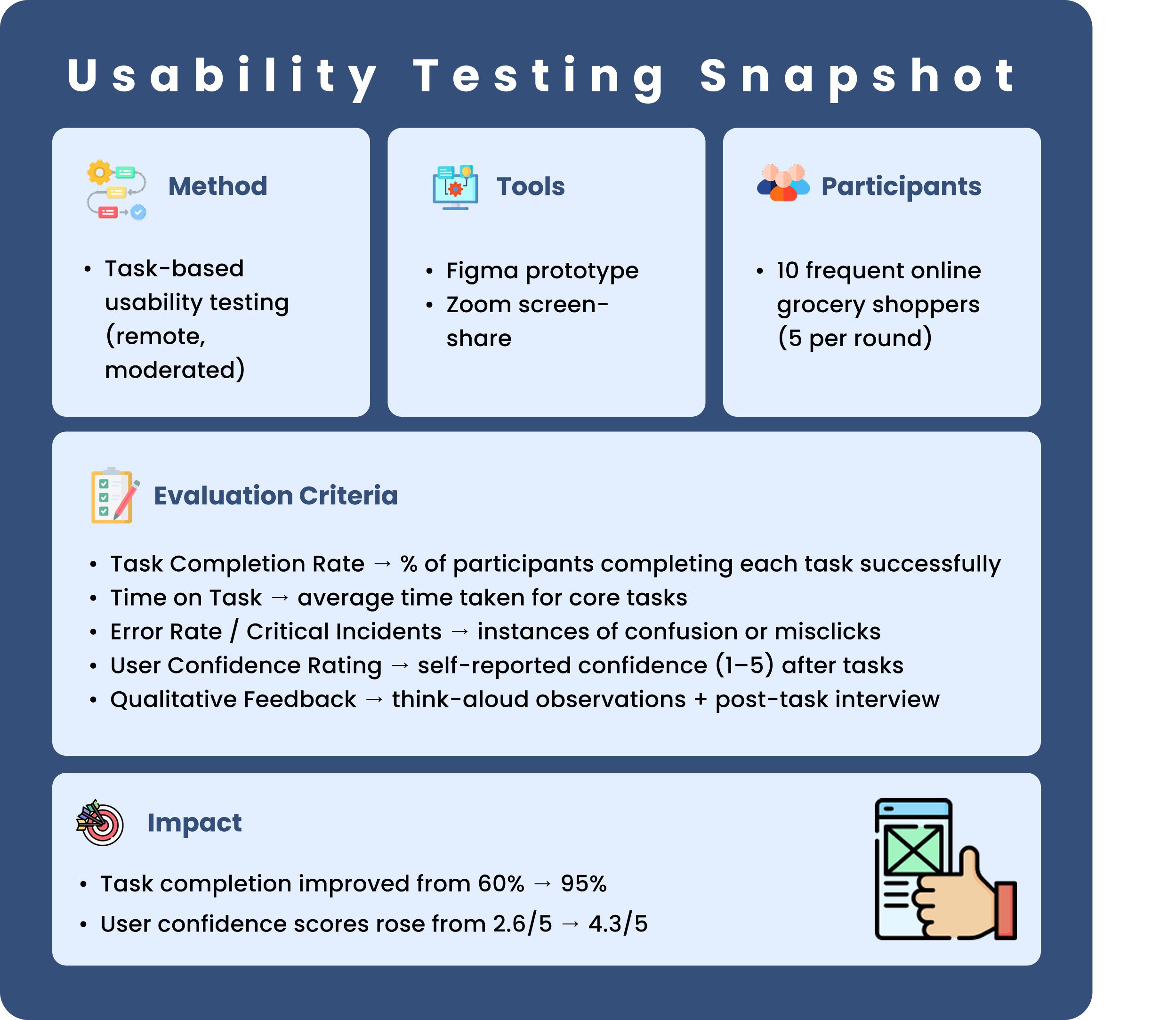
To validate and refine our ideas, I conducted two rounds of moderated usability testing (n=5 each). Each round involved task-based sessions covering the grocery journey — from produce selection to checkout.
Through this process, we followed a see–say–fix rhythm:
-
See → Users interacted with the wireframe.
-
Say → They shared what worked and what didn’t.
-
Fix → We refined the design in the next iteration.
This iterative cycle not only improved the usability and confidence of core features like Freshness Selector, Substitution Preferences, and Shopper Chat, but also demonstrated measurable impact.
05. The Output
Freshness Selector Feature
Bringing Confidence Back to Produce Shopping
Iteration 1
Basic Selector: Users could choose Ripe, Under Ripe, or Best Today.
Iteration 2
Added a Ripening Forecast (e.g., Ripe Tomorrow, Ripe in 2 Days).
Iteration 3
Layered in verifiable in-store cues — color and texture descriptions


“This doesn’t give me enough detail. How do I know when exactly it’ll ripen?”
Users lacked the predictability to plan meals confidently.
“Better, but what if the shopper can’t actually judge that correctly?”
“This finally feels like I’m choosing produce myself.”
Forecasts helped, but users still lacked trust in shopper judgment.
Users felt the app replicated the in-store selection experience.
Impact
User confidence scores jumped from 2.8/5 → 4.4/5
Task completion improved to 95%
Substitution Preferences
Transforming substitutions from manual notes to clear choices
Iteration 1
Users typed notes to specify substitutions for the shopper
Iteration 2
Choose replacement (brand/variant) Integrated directly with product catalog along with structured rules

“I can’t recall every brand name, I just want to pick from a list.”
Increased manual effort and cognitive load

“Now I can set clear rules or just pick the exact brand myself.”
Restored user control and reduced substitution anxiety.
Impact
User confidence in substitutions rose from 2.5/5 → 4.2/5
Time on task: ~1:35 → 0:50 mins
Shopper Chat Feature
Building Real-Time Communication Between Shoppers and Users
Iteration 1
Introduced a basic chat channel for real-time communication

Iteration 2
Added read receipts and media attachment to chat

Iteration 3
Added real-time push notifications for shopping milestones

“This is okay but iI can't tell if the shopper actually saw my message.”
Users felt uncertain their instructions were acknowledged
“At least now I know my message is read by the shopper.
“I feel looped into the process, just like being at the store.”
Improved assurance, but still lacked proactive updates.
Users felt the app replicated the in-store selection experience.
Impact
User trust ratings rose from 2.7/5 → 4.5/5
Perceived transparency increased by 60% in post-test surveys
Grocery Shopping List Feature
Building Real-Time Communication Between Shoppers and Users
Iteration 1
Basic List Maker: Users noted down items manually
Iteration 2
Smart Lists with Catalogue Integration
Iteration 3
Collaborative Shopping Lists: shared lists where others could add items in real time.


This feels like a notepad, I still need to search and add everything later.
“Now I can build my cart as I plan—much faster.”
We can plan meals and events together, everyone adds what they want.”
Helped organize, but added extra work.
Reduced friction, supported event-based planning.
Turned grocery shopping into a collaborative, social experience.
Impact
Item add time cut by 60%
Search integration reduced entry errors by 70%.
06. Impact at a Glance
5
core features launched directly mapped to user pain points
3
competitor gaps closed (freshness transparency, real-time substitution control, reusable grocery lists)
95%
task completion rate across core shopping tasks (up from 60% in Round 1)
2x
faster checkout: average time dropped from 3.8 mins → 1.9 mins after redesign
+1.7
point lift in user confidence scores (2.6/5 → 4.3/5) across tested features
07. What I Bring to Future UX Projects
This project sharpened my ability to translate complex user pain points into confidence-boosting product solutions, while ensuring that design decisions were research-backed, iterative, and adoption-ready.


